
Save the Seals!
A Deep Dive into a Nonprofit Website Redesign
Summary
About The Marine Mammal Center.
The Marine Mammal Center (TMMC) is nonprofit organization dedicated to protecting marine life across the west coast through animal care, research, and education. This nonprofit organization based in Sausalito, CA, depends on the donations and community engagement to rehabilitate the ocean.
About The Project
Our user research showed that people typically commit to nonprofit organizations that are transparent with their work and funds, and are typically drawn to social issues that they can relate to. During our stakeholder interviews and preliminary user testing, we found that it was difficult to access important links like donations, volunteering, and adopt-a-seal. Our solution was to create a more cohesive information hierarchy, reorganize the content, and highlight the key features.
Deliverables.
Project Proposal, User Interview, Competitor Analysis, Heuristic Evaluation, User Path, Guerrilla UI Test, Stakeholder Interview, Mood Board, Affinity Diagram, Empathy Map, User Persona, User Insights, POV Statement, Style Guide, User Scenario, User Journey Map, Storyboard, Sitemap, Card Sorting, Lo- to Hi-Fidelity Prototyping, UI Analysis, Style Guide, Prioritization Matrix, Iterations, Usability Testing.
Roles.
UX researcher & designer
Timeline.
October 14 - 27, 2020
Tools.
G-Suite, Figma, Miro, InVision
Empathizing with Users
initial research
For our user research, we were curious to hear what nonprofit organizations people cared about and why they cared about them. Furthermore, we wanted to know what qualities people value when supporting an organization.
During our user interviews and surveys, we found that our average user:
Prioritizes transparency when looking for an organization to donate and volunteer at (ex: where is my money going?)
Is more likely to volunteer or donate to an organization if they felt like that their contributions would make an impact
Is less likely to explore a “cluttered” website, as it can be difficult to find information and navigate
Is drawn to social issues that they can empathize with
Depends on word-of-mouth to find volunteer opportunities

a close look at the original website
Heuristics Evaluation
The overall feel of the website felt a bit dated. Icons, colors, and formatting were inconsistent throughout pages. Because each parent page and its child pages had different formatting, users felt that it was difficult locating their starting point and what information they hadn’t seen yet. The search bar was hidden within the navigation, instead of formatted in an easily accessible/identifiable area.
Usability Testing
During our user testing, people noted that the original website felt cluttered with information, without a clear call to action. Furthermore, this layout made it difficult to identify important pieces of information. We learned that users felt that the information on the page was more geared towards those that are interested in the fellowship programs, and did not have much information about how to donate or support the organization.
Defining the Problem
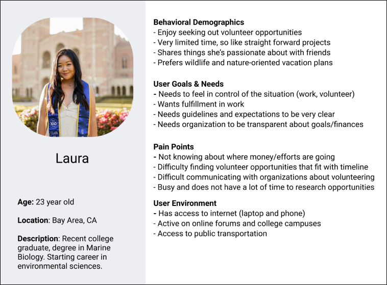
Using survey insights, we created our user persona, Laura, to help us identify what key features and services we should prioritize in our website redesign. We identified her background, goals and needs, as well as her pain points. These insights allow us to empathize with our users and recognize how our solutions might solve a problem they have.
who are the users we are solving for?
Using our user persona, Laura, we identified what key features and services to prioritize in our website redesign. Like many of the users we interviewed, Laura prioritizes and engages with nonprofits that have a clear mission and are transparent with their donation use.
what are we solving?
In order to rehabilitate and restore the marine life in the West Coast, the Marine Mammal Center is seeking donations, volunteers, and public engagement. In our research, we found that people are typically drawn to nonprofit organizations that are transparent with what they do and how funds are being used. We also found that they are more likely to volunteer when they feel that they are making a positive impact. How might we redesign The Marine Mammal Center’s website so that users feel confident that their contributions are making a direct impact on the environment?
visualizing the process
In the storyboard below, we visualized a solution that would benefit both the nonprofit organization and their website users:

Ideating
Taking insights from our survey and interview data, we were able to identify what our users want and need when looking for a nonprofit organization to support and engage with. After identifying user’s pain points with the current The Marine Mammal Center' website, we began ideating on how to bridge our stakeholder’s needs with user needs.
narrowing our focus
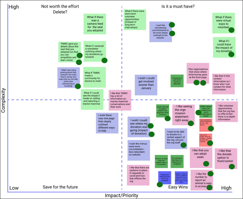
Using a feature prioritization matrix, we identified which features we would prioritize for this website redesign. The features and services we focused on were:
The Navigation
Donations
Volunteering
Adopt-a-Seal
Internships

restructuring the website
Using the card sorting technique, we reorganized TMMC’s navigation and page structure. Some examples of changes that were made were:
Removing redundant links: There were many duplicate links on the navigation.
Reorganizing information hierarchy: During user testing, we found that users often looked for internship information under the “Get Involved” tab, instead of the “Science” tab.
Highlighting ways to contribute: The Marine Mammal Center offers many different types of volunteer, internship, and academic programs but the website structure makes it difficult to find ways to get involved.
Prototyping
building upon the style guide
We built upon the style guide that TMMC shared with us during stakeholder interviews.
This website redesign was to mimic the color and vibrancy of both land and ocean.

low-fidelity prototype
In our user tests, we found that the sidebar navigation and the top navigation were both redundant. To make the pages feel less cluttered, we created a global navigation and removed the side navigation. We removed redundant links and reorganized the information so that it would be easier to scan.

mid-fidelity prototype
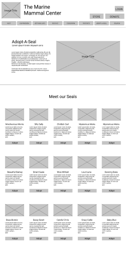
During our next round of usability testing, we found that users had a difficult time using the updated global navigation. Because the original navigation did not have a dropdown icon, it was unclear which menu items nested more links. We added an icon, that, when hovered, displays the secondary navigation. Furthermore, we highlighted the Adopt-A-Seal, a donation program that The Marine Mammal Center depends on. The search bar is also now easier to identify than the original navigation.

high-fidelity prototype
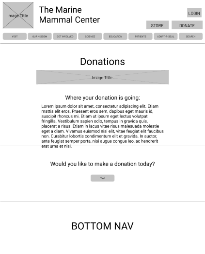
We learned, through five-second usability testing, that the because the header was too large, it was difficult to view the page. We shortened our header to highlight the content. We also added a soft gradient too match the “ocean-like” feel that the organization sought for their website redesign. We added pictures of the seals to build the emotional connection from the site to the user. It is easier to identify how donations are being used.

Final Thoughts
It was a great opportunity working with stakeholders for this website redesign. Moving forward, it would be great to highlight other TMMC focuses, like the education programs that they offer to aspiring veterinarians around the world. Because the Marine Mammal Centers offers a variety of programs, ways to help, and more, I would love to work on an even more cohesive information architecture to showcase other programs that TMMC offers, such as email newsletters, forums, and school programs.
